Project Goals & Strategic Approach
The Ministry of Health website redesign aimed to deliver a highly personalized digital experience
for a diverse audience, addressing the challenge of vast, complex content ecosystems.
My strategic mandate focused on user segmentation, tailored user journeys, and information architecture optimization,
ensuring each visitor can efficiently access the most relevant resources.
As UX Lead and Art Director, I spearheaded cross-functional teams,
combining strategic UX research, system analysis, and end-to-end UI leadership.
I directly managed all aspects of visual design, architected a comprehensive design system,
defined interaction paradigms, and translated research-driven insights
into actionable design and technical deliverables,
ensuring complete alignment between user needs and organizational objectives.
Design, Research & Impact Highlights
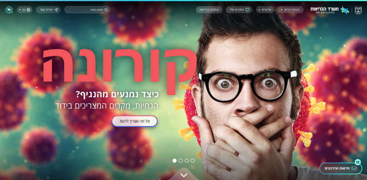
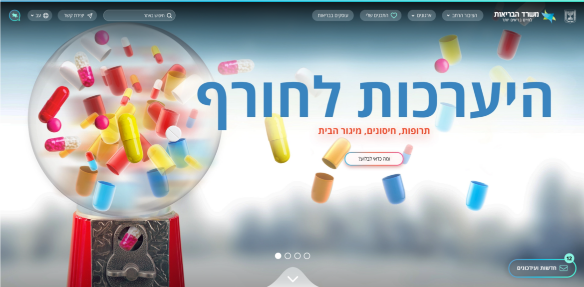
To create a modern, intuitive, and high-performing digital experience,
we applied application-inspired interactions, glassmorphism, and parallax effects,
designed to enhance visual hierarchy and content discoverability.
The project was driven by qualitative and quantitative UX research,
including user interviews, analytics reviews, and usability testing, which informed content prioritization,
navigational flows, and personalization logic. This evidence-based approach ensured that design decisions were measurable
and aligned with real user behaviors.
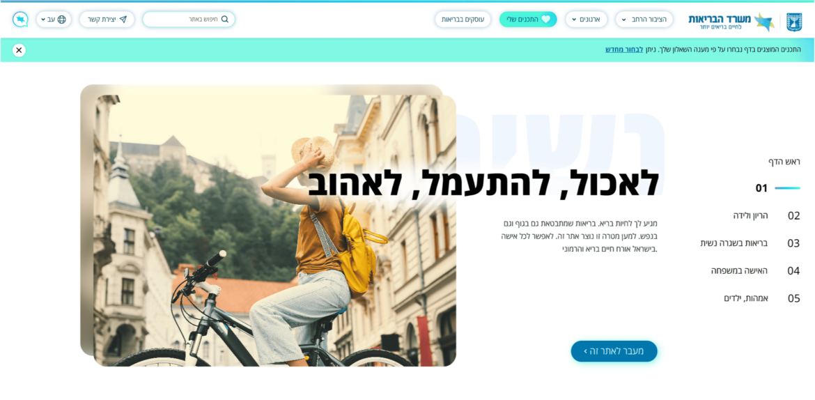
I directly managed all aspects of visual design, including art direction, UI execution,
and creation of a comprehensive design system, establishing cohesive interaction patterns and a consistent visual language.
The result is a scalable, user-centric digital platform that balances aesthetics, usability, and strategic goals,
providing a lightweight, action-oriented, and visually compelling experience.