UX Strategy, Research & Execution
Led end-to-end UX for a national-scale healthcare appointment system,
in direct collaboration with the Mother, Child & Adolescent Department at the Ministry of Health.
Conducted domain research and service journey mapping of existing processes,
and redefined the user flow to align with the child’s developmental stages and the mother’s contextual needs.
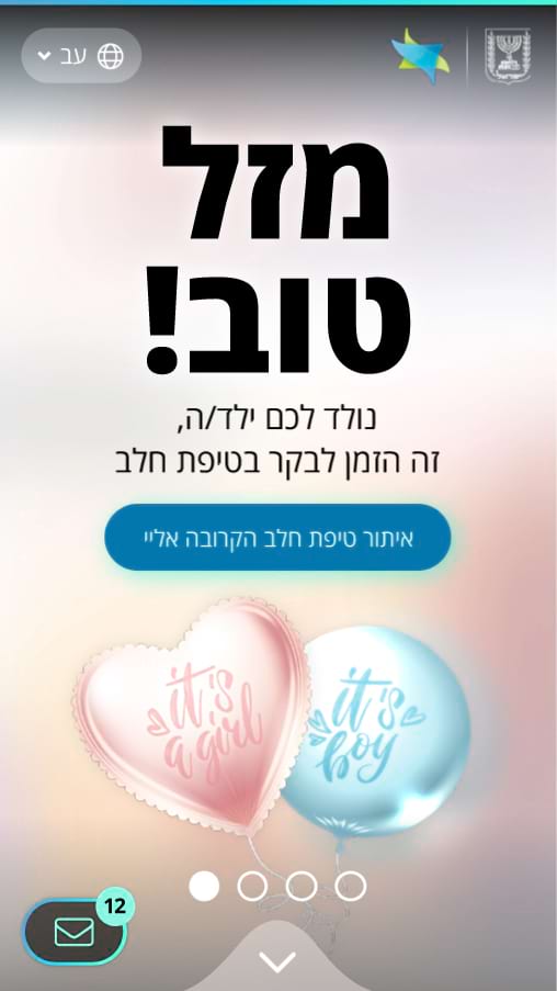
The experience was intentionally designed to be soft, supportive, and emotionally considerate —
creating a sense of accompaniment and reassurance for parents throughout the child’s developmental journey.
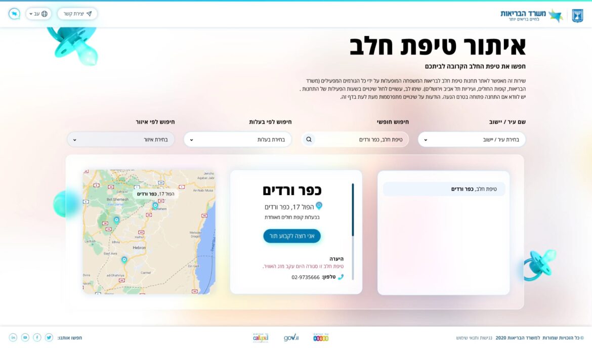
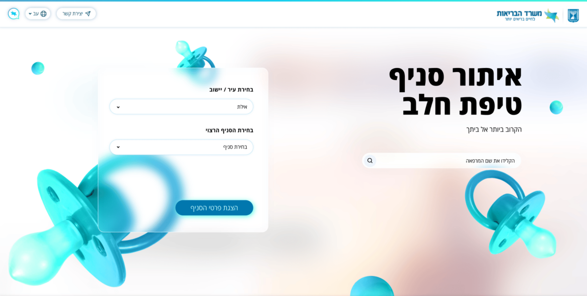
Designed the information architecture and system logic to leverage authenticated Gov.il data
(such as the child’s age), enabling full personalization from the initial entry point.
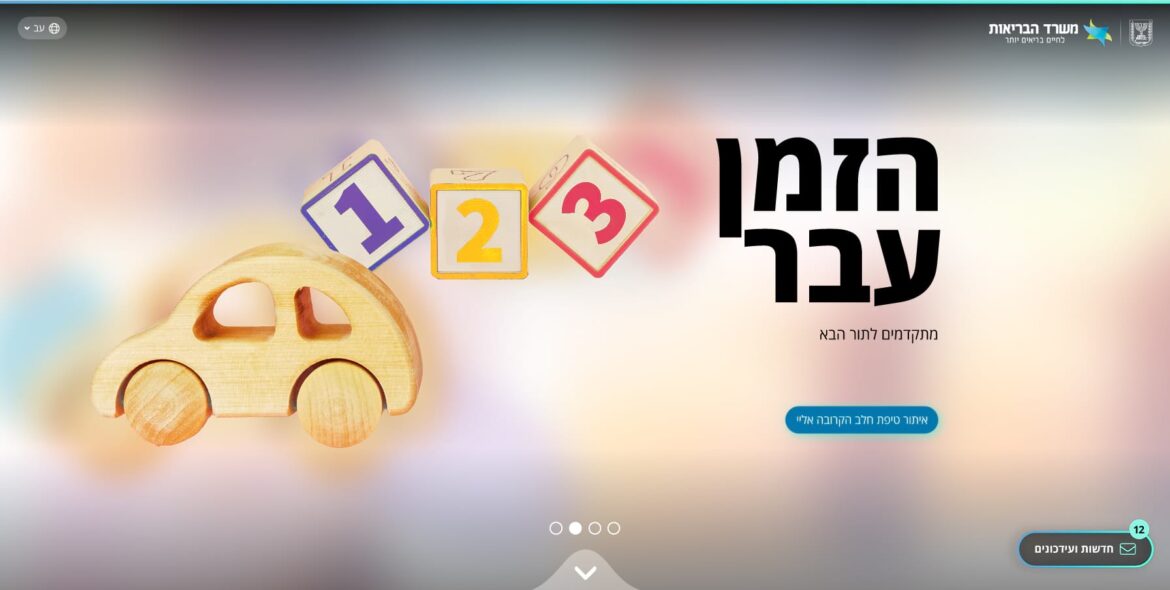
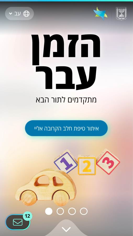
The landing page was structured into three horizontal sections, each representing a distinct developmental stage,
significantly shortening the path to the relevant appointment type and replacing generic navigation patterns and form-heavy flows.
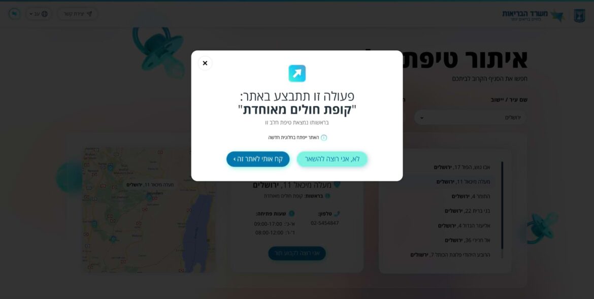
Beyond the primary happy path, UX solutions were designed to address edge cases and complex scenarios,
informed by an understanding of large-scale governmental system constraints,
high information density, and the emotional sensitivity of the user base.
The work focused on reducing cognitive load, minimizing task completion time,
and strengthening users’ sense of trust, confidence, and ongoing guidance within the system.
UI Direction, Visual System & Glassmorphism Implementation
As Art Director, I defined the visual language and led the UI team
in translating UX principles into a modern, multi-layered design system with a clear sense of visual depth.
The interface is built on Glassmorphism as a foundational UX/UI design principle,
using semi-transparent backgrounds with precisely calibrated blur values,
controlled contrast, and clear layer separation to establish hierarchy and structure.
3D elements were layered above this foundation, with intermediate layers of duplicated, scaled, and blurred elements strategically placed
between background and foreground layers to amplify depth and dimensionality without compromising readability.
Rounded containers with varying blur values were used to host textual content
in a readable and fluid manner within a visually complex layered environment.
Widely spread colored shadows were applied in line with contemporary design trends,
while maintaining clear visual hierarchy and affordance.
To reinforce spatial perception and dimensionality, subtle hover animations were added to key 3D elements,
enhancing interactivity and contributing to a polished, high-quality interaction experience.